| Parameters | Description | |||||||||||
|---|---|---|---|---|---|---|---|---|---|---|---|---|
| Title | Title of the Gauge Chart | |||||||||||
| Type | Type of the widget | |||||||||||
| Properties | ||||||||||||
| Columns | The gauge chart will be organized by multiple columns on the widget. Minimum is 1. | |||||||||||
| Font Color | Font color of the Gauge Chart | |||||||||||
| Gauge Details: | Data Source |
Data source of each gauge chart, user can bind to an asset attribute value and an alarm rule • If it’s asset attribute value: User can select one asset from Data Management module and one attribute of the selected asset • If it’s alarm: User can select one alarm rule (has the alarm type Analog) of the selected attribute |
||||||||||
| Label | Name of the gauge chart. It can be the name of the attribute that is used as the data source or entered by the user. | |||||||||||
| UoM | Unit of Measurement of data. It can be the UoM of the attribute that is used as the data source or entered by the user. | |||||||||||
| Show Label | Checkbox to show/hide the gauge chart label | |||||||||||
| Data Format |
Checkbox to change the value format display, detailed as: • Uncheck: Display as raw data format • Check: Display a big number with a metric prefix before the base unit. Each prefix has a unique symbol as shown in the table below 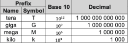
|
|||||||||||
| Value UoM |
Check box to show/hide value UoM of Gauge Chart. User can choose to display UoM as prefix or suffix of value |
|||||||||||
| Axis UoM | Check box to show/hide axis UoM of Gauge Chart. User can choose to display UoM as prefix or suffix of value | |||||||||||
| Difference |
Represents the difference between the current data source value and the old value. User can choose one of two types: • % : Display percentage difference • Absolute: Display the difference value |
|||||||||||
| Simple Mode | Minimalist gauge chart display mode: hides some properties on the widget (label, uom, difference). | |||||||||||
| Value Color | Color of gauge chart | |||||||||||
| Gauge chart’s Start range – End Rage | Start and end range values of gauge chart | |||||||||||
| Target Line |
Checkbox to show/hide the target line |
|||||||||||
| Target Color | Color of the target line | |||||||||||
| Target value | Value to display the target line on the widget. Gauge chart’s start range <= target value <= gauge chart’s end range |
|||||||||||
| Show Target Value | Checkbox to show/hide the value of the target line | |||||||||||
| Step Range detail | Start range - End Range |
Gauge chart data source step value range.The step range cannot exceed the Gauge chart range. The range of the steps cannot overlap (the next Start range must be greater than or equal to the previous End range). If the gauge chart is bound to an alarm rule, the step ranges will be automatically generated from the thresholds of the alarm conditions. The user cannot change them. |
||||||||||
| Step Color | Color of the part on the gauge chart If the gauge chart is bound to an alarm rule, the default color of the step ranges will be automatically generated from the color of the alarm condition's priority. The user can change the color. | |||||||||||
| Remove | Button to delete the step range of the gauge chart if the gauge chart is not bound to an alarm rule | |||||||||||
| New Step | Button to add 1 step range to the gauge chart if the gauge chart is not bound to an alarm rule | |||||||||||
| Add Gauge | Button to add new gauge chart of the widget | |||||||||||