| Parameters | Description | |
|---|---|---|
| Title | Field to set a name for the card widget | |
| Type | User must select the “Card” option to use it | |
| Properties | ||
| Text Orientation | Set text on all cards in vertical or horizontal orientation | |
| Column | Determine the number of columns of widget | |
| Grid Gap | The gap between both cards in pixels | |
| Unit Placement | Set the place of UoM after (suffix) or before (prefix) the value displayed | |
| Show Full Text | Display full card content instead of 3-dots for the hidden texts | |
| Width | Set width in pixels for the card size | |
| Height | Set height in pixels for the card size | |
| Radius | Set the radius size for card corners | |
| Title Font Size | Set font size for the card label | |
| Value Font Size | Set font size for the card value | |
| UoM Font Size | Set font size for the UoM | |
| Card Details: | Data Source | Bind a specific attribute belonging to one asset in the Data Management module, and related alarms if needed |
| Label | Set the card title | |
| UoM | Set the UoM for the value displayed | |
| Value Format |
Drop-down options to select the value format display, detailed as + None – display as raw data format + Prefix – Display a big number with a metric prefix before the base unit. Each prefix has a unique symbol as shown in the table below 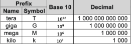
+ Scientific - display option replaces part of the number with the scientific notation e ± n. In which e stands for the exponent and multiplies the preceding number by 10 to the nth power Ex: 123,456,789,654.32 -> 1.23e+11 |
|
| Font Color | Set font color for the content display | |
| Select Icon | Binding a specific icon as the media type in 03 ways: Upload file, access the Dashboard Media, or asset media in the Data Management module | |
| Background Color | Set color for the card background | |
| Gradient Color | User can enter up to 10 for the card background color. It needs to select the gradient color direction display (vertical / horizontal) along with selecting each color when they're visible | |
| Background Image | Binding a specific image as the media type to display in the card background in 03 ways: Upload file, access the Dashboard Media, or asset media in the Data Management module | |
| Step Range | - “New Step”: Button to add new steps on each card. User is able to add up to 5 steps per card and their range value must be continuous. One step includes + Start Range: indicate the range starts from which value + End Range: indicate the range ends from which value + Step Color: set the specific color for the range displayed + Remove: click to remove the current step |
|
| Add Card | Button to add new cards for the widget (click "x" icon per card to remove) | |
| Card preview | Area to view how the card widget displayed by configuration | |
| Widget interaction (only display data) | ||